Google logo goes sans-serif: A look at other iconic brands that created a buzz with their logos

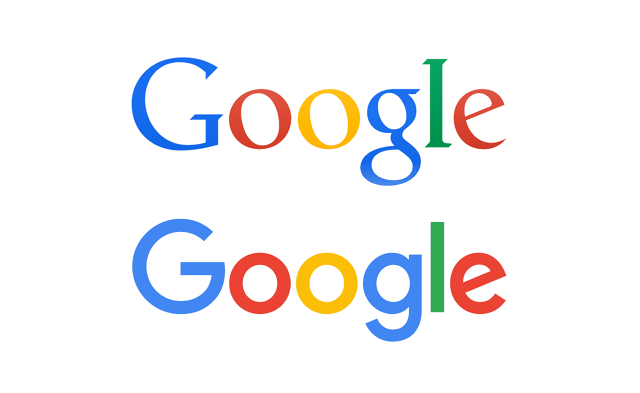
Tech giant Google on Tuesday (September 1, 2015) night surprised many of its users by releasing its new serif-free logo with a two-minute video that showcases the range of their products to the evolution of their look and feel. This change comes within a month of restructuring the new company Alphabet.
This 17-year old company has changed its logo a couple of times in the past and each time it’s a new concept that represents their progressive journey towards the latest in technologies.
From a more intensely coloured Google , that had flattened letters and no shadows, the logo has become of lighter tone, and of sans-serif typo, maintaining the slanted ‘e’ .
On this special occasion, we take a look at a few other iconic international brands and their oldest and latest logos, that have defied time and conquered markets and hearts forever.
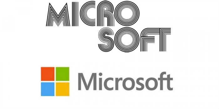
1. Microsoft
Microsoft has changed its logo many times over the years and the change has been anything but subtle. From the multiple lines version of the 1970s to the flying window icon of late 1990s to the latest sober Window icon, Microsoft has tried it all.
On the top of the picture, is what Microsoft looked like when it was first launched in 1975 and today we are way better off as you can see the latest logo below. The new logo was brought out in 2012.
2. Yahoo!
Yahoo too has changed its icon many times and not every time has it succeeded in garnering support for doing so. From the initial exclamatory mark, some red dots and funky red typo of 1994, the logo has over the years become more sober and purple.
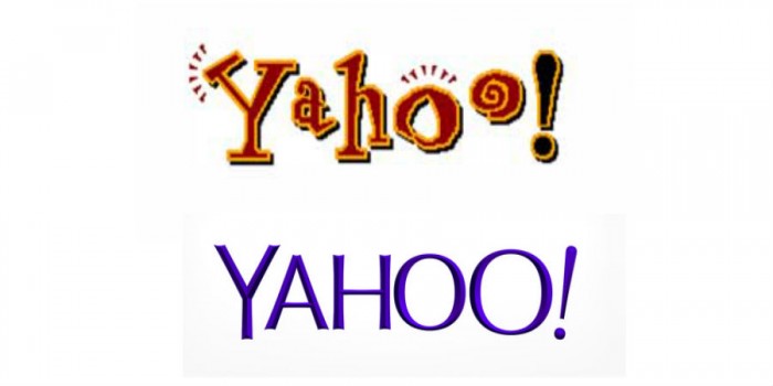
The shade of purple of the 90s was more liked than the most recent one brought about in 2013. Anyways, the picture above tells you where is the difference in how we said Yahoo, when it first came about in 1994 and how we say it now!!
3. Apple
Apple’s logo changes, at least from the first to the second, was pretty drastic. The very first logo, created in 1976 had an elaborate logo of Newton sitting under a tree with a dangling apple and the tag read ““Newton… A Mind Forever Voyaging Through Strange Seas of Thought … Alone.”
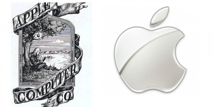
Not it’s just a bitten apple (on the right side mind you!), plain, simple and monochromatic. This logo was designed in 1999 and hasn’t changed since then. It has both aqua-themed and glass-themed versions. Well, that’s “Think(ing) Different” isn’t it?
4. Levis Strauss
Doesn’t the name in itself sound endearing and trustworthy? Well, it’s been so from 1886. The two famous horses in the logo won the faith of people from the moment they descended on markets in the 1880s America. In fact they became such a household name that people always asked for “those pants with two horses.”
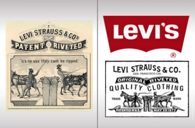
It’s very interesting to note the changes in the logo. Not until 1928 was the “Levi’s” part of it introduced. The tagline in the first logo read “It’s no use, they can’t be ripped”, whereas the latest one just says “Quality Clothing”.
While the previous one is obviously black and white, the image of the horses takes the whole space, whereas this is compressed in the latest version, allowing the trusted name Levi’s to take all the attention.
5. Shell Oil Company
Shell Oil is one of America’s largest oil and natural gas producers. With a whopping 87,000 employees in 70 countries including India, the company is an ‘oil major’. The logo of the company, though has changed three times, is one of the long standing ones.
In 1891 Marcus Samuel gave it a white mussel shell look, on a black background. In 1904, it got the shape of a scallop shell and retains this shape today with a major change in colors, a combination of red and yellow, introduced in 1915. After this, the logo has remained unchanged and stamped on people’s minds.
Do you know that the secret behind the shell shape (of the brand’s logo), is India, from where shells were taken to London, in exchange for Kerosene, for purposes of decoration?
6. The Royal Enfield
This motorcycle company has an interesting logo-history as far as India is concerned, and almost puts India on the world map for continuing an age old legacy from another country, Britain.
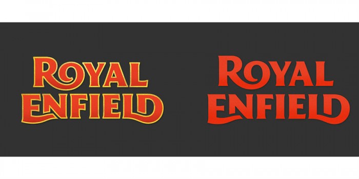
Royal Enfield began in the town of Redditch in the UK. Though it’s popularity waned by the 1970s there, it’s branch in India only blossomed and took over production. Last year, their logo saw a change and we can say the latter definitely wins the game. The latest logo was designed by India-based company called Codesign. Go India!
7. Johnson & Johnson
Founded in New Jersey, in 1886, Johnson & Johnson was the world’s first mass seller of surgical dressings. The logo’s style interestingly takes after the design of one of the Johnson brothers (founders), James Wood Johnson’s signature. Now too the design style remains, so does the handwriting except that the older ones look closer to the signature, while the later ones are more customized.
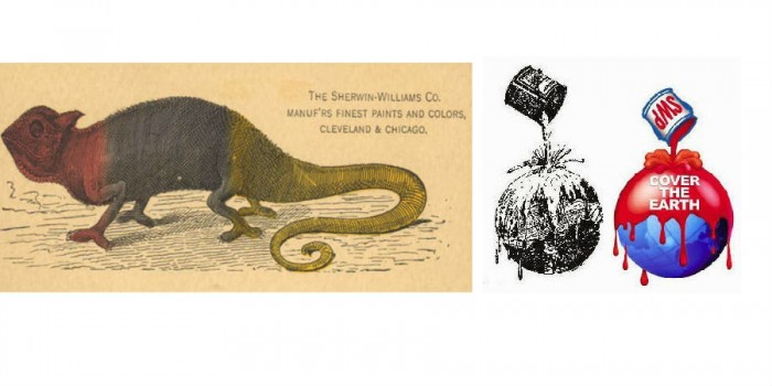
8. Sherwin-Williams
The company is one of the largest producers and distributors of paints. Started in 1866 by George Ford, the company had a chameleon as its logo initially, and in 1905 Ford changed it to a black&white image of paint falling all over the earth, thus conveying the idea of colouring everything around us. Today, this logo is retained with better colouring, as you can see.
These companies enjoy time defying renown and their logos have played a great part in invoking and maintaining this trust.
Keeping this in mind, we only hope to see Google, our most trusted browser, getting better and better.
Also read:
Google essays a new ‘Alphabet’! 10 must-know facts about its Chennai-born CEO Sundar Pichai
What happened to Google’s Project Ara?

OMG-inducing, share-compelling, like-attracting, clutter-breaking, thought-provoking, myth-busting content from the country’s leading content curators. read on...